 |
| Authors own image |
 |
| Image source: www.nytimes.com I feel these WWF campaign posters are successful because the red boarder highlights the importance and helps the audience focus on the information, the large scale image draws me in and makes me want to learn and discover more about the campaign. The simple composition ensures the campaign is easy to understand and highlights the seriousness of the awareness subject. Finally the use of conflicting colours and bold typography ensures the message stands out and becomes eye catching. |
Alongside the posters the WWF website contains a video involving a live art experience by Splash featuring the artist Christina Grenard. The video involves soft, delicate background music which conflicts with the visual of the artist violently throwing paint on to a canvas in a large dark room. Between the visuals of brush strokes shocking facts are revealed - I feel this is successful as it creates a build up and an impact for the audience.
 |
| Authors own image |
I also looked into the Greenpeace 'Kleenex' campaign posters to identify key aspects needed to make it successful. Both posters involve large, bold typography which stands out and catches the audiences attention. I enjoy how Greenpeace has highlighted an action which the majority of the public do to highlight how we are impacting the forest and environment without even realising. In both posters the Greenpeace logo is present which makes the campaign become identified and recognisable. I feel the bottom poster involving yellow typography is hard to read and understand as the composition and image distorts it and makes it difficult to focus on. The use of a white banner in both posters highlights key information and helps you to focus on it's importance.
 |
| Authors own image |
 |
| Authors own image |
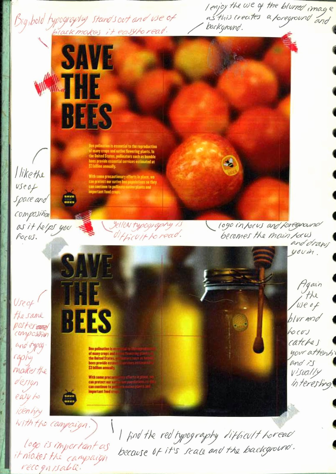
Although I have many campaign ideas to create awareness about the importance of bees I have started to question why I need to engage in this subject and make awareness for it when there are already many existing organisations focusing on the topic. For example 'Save The Bees' have created a range of posters which I feel are visually successful - I enjoy the use of the space and composition throughout the posters and the big, bold typography. I also enjoy how each poster uses a similar layout which helps make the campaign and organisation identified and recognisable; the simple visual helps the audience easily understand.
Whilst researching I discovered the Co-operative has a large focus on the importance of bees subject. However, I was quite shocked to have only found it when it was created in 2011 - they not only reach out to volunteers they have also designed a phone app which increases your awareness of bees whilst playing and enjoying the game. Although I feel aspects of the campaign and group could be successful I feel the advertising and creating awareness to a large audience has been unsuccessful and needs improvement.
 |
| Authors own image |
 |
| Authors own image |
No comments:
Post a Comment