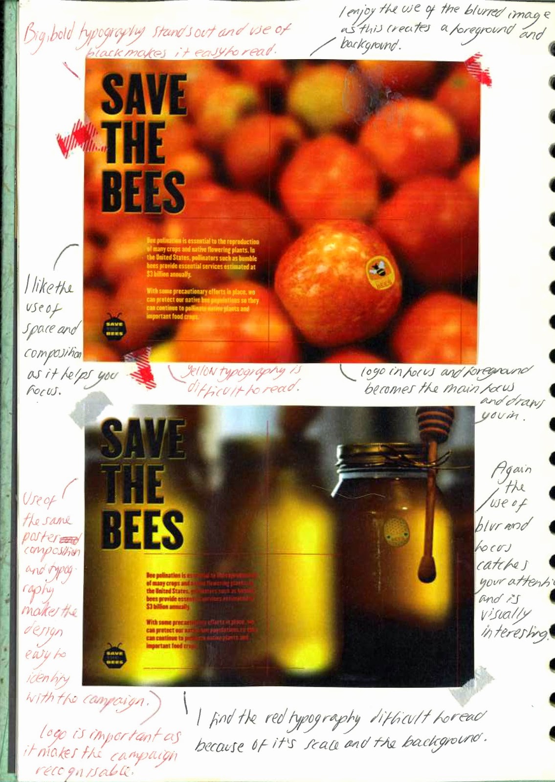
Tuesday 31 March 2015

Victoria and Albert Visit

Authors own image
Authors own image
(Recycled garments)
My aim for visiting the Victoria and Albert museum consisted of looking at the embroidered and material pieces as an inspiration for using texture within my own design. The first piece I observed was from South East India and was created for the western market. I was really drawn in by the detail and its scale, I also really enjoy the use of colour and feel this contributes to the sophisticated outcome. This work has inspired me to explore a range of colours to understand what would be most successful and appropriate for my target audience.  I do not feel I would need to use as much detail as this design because I do not feel it would be appropriate for my audience. I also really enjoy this next coverlet from Bangladesh and feel it looked more textured than the previous design. I discovered it was made from recycled garments; I need to consider the materials I will use.
Authors own image

This floor spread was full of texture and colour which really stood out; I really enjoy the use of tones and feel the petals are a simple form and would be successful within my own design.
Authors own image
The boarder of this piece really draw me in because the small scale white dots created a wide range of texture. I really adore this simple technique as it would be easy to duplicate in my own work. I feel I could explore this in a range of colours and stitching. The next design is also interesting because it is simple and is easier to focus on without getting distracted - this would be more effective for my target audience.
Authors own image


The repeated pattern is eye-catching and visually interesting, again I could explore this technique to understand how it would effect my design and the awareness I am trying to create.


Whilst at the museum I decided it would be interesting to look at floral tiles - although I will not be using hard ceramics as a material  I felt it would be useful to look at the forms and colours of the designs. I really enjoy the bright, bold block colours and feel these really stood out. I feel the simple forms would be successful within my own designs and book as my target audience would be able to focus and understand the work. 
Overall I feel my visit to the museum has inspired me to start experimenting and exploring texture within my own work.

Monday 30 March 2015

Bees Pollinate 70 Crops

Authors own image
Authors own image

Authors own image


Here I have started to explore some crops bees pollinate and which I may use within my book. I feel the illustrations would be successful in my book design as they are bright and stand out. I enjoy the use of watercolours as the range of tones contribute to the texture.


I scanned my crop illustrations and have started to experiment with them on Photoshop. Here I have added a range of filters to create textures and interesting visuals. I really enjoy some of the outcomes because the texture is subtle but works really well  to highlight tones. My next intention will be to continue to explore crop illustrations and begin to consider physical texture on the page.

Friday 27 March 2015

Existing books

I wanted to look at existing illustrated children's books to identify key features I may need to consider within my own designs. I really like the use of simple colours and composition within The Winnie Pooh collection as it easy to follow and understand. i was extremely drawn in and inspired by the repeated patterns of bees and will consider a similar technique in my own design. I also really enjoy the simple and delicate illustrations throughout the Beatrix Potter book series and feel the use of the white backgrounds helps them stand out. However, I am unsure if such a simple composition and elements would be successful for my awareness book because I need my target audience t engage and learn from each page without losing interest.
Authors own image
I really enjoy the book titled 'The Sleepy Pig' because of the texture involved - each page is embossed and allows you not to only see but feel the forms on the page. I feel this would be an interesting technique to explore but I am unsure how to do it and will need to research into it. 
Authors own image

I am huge fan of the Mr.Men books because they are so simple but so engaging for my target audience. The bright, bold colours are exciting and draw you in whilst the simple geometric like forms along with short sentences are easy to understand, learn from and follow. Overall I feel looking at existing books has helped me to consider aspects and elements for my own design.

Thursday 26 March 2015

Robin Paris

Image source: http://www.countrylovers.co.uk
Robin Paris is a batik artist mainly inspired by her surroundings - the Cornish countryside; nature and the environment are the main features in Robin's work. I really enjoy the organic colours and marks the artist uses as this contributes to the texture. I like this batik because the caterpillar positioned in the centre is eye-catching and draws you into the work. I would like to revisit this technique within my own work and will be researching places I can go to se professional tools; if this fails I may try the materials I previously used.

Exploring New Techniques

Authors own image


Whilst at the Victoria and Albert museum I picked up this postcard as I found the visuals really delicate and interesting. I discovered it was created by Anna Atkins and was a cyanotype of a poppy; I really enjoy the silhouette appearance and would like to explore this technique myself. I also want to explore a range of mediums to highlight what would be most successful in my own work and also what would be appropriate for my target audience. 
Authors own image

I was able to create a response to the postcard as I learnt the photographic process used to chemicals - ammonium iron(III) citrate and potassium ferricyanide, when exposed to light a cyan blue print is revealed. I used strips of grass and a leaf to create my outcomes but feel disappointed with the results as I used sunlight to expose the chemicals in comparison to Atkins who used a UV light. I do not feel I will use this technique in my final design as it was a long process and the visuals are difficult to identify.
Authors own image
Although I found my first experience of creating a cyanotype difficult I tried to revisit the technique but this time combine it with oil and ink. My intention was to create organic, abstract visuals with the use of greens and yellows; I really enjoyed the technique as it produced interesting outcomes which I could not control. However, I do not feel the visuals are 'organic' I feel they remind me of scientific microbes instead. I will not being using this technique further as I do not feel the outcomes are relevant to my subject focus.
Authors own image
My aim for this project is to push myself out of my comfort zone and not always rely on computer softwares to create design. Therefore, I have explored traditional methods using wax and ink known as 'Batik.' As I do not have the proper equipment to do this I tried to compromise with some scrap metal and by melting the wax in a sauce pan. I found it difficult to control when creating my floral visuals as the wax was so hot and dripped everywhere. However, I feel my outcomes are successful considering how they were created. I really enjoy the leaf outcomes as the material is thick and was easy to iron the wax off. I feel I could consider using this technique in my book design because although a messy outcome, I feel it would add texture and engage the children with the use of the bright ink.
Authors own image

Wednesday 25 March 2015

Design Focus

Authors own image
My focus is going to be educating children about bees and their importance. It relates to 'Sustainable Nature' because bees provide humans and plants with a lot but unfortunately they are decreasing in numbers. Therefore educating children at a young age will be sustainable as they will grow up knowing and will pass their knowledge onto their own children. 
I will be creating a book containing information and the importance of bees - I chose children as my target audience therefore will need to engage them in the book. I feel aiming at children will be most successful as there are many existing campaigns aimed at adults, such as the Co op campaign.
Authors own image: This image represents the idea I have for the content of each page.

Tuesday 24 March 2015

Observing My Audience and Subject Research

Authors own image
Authors own image
I visited the Natural History Museum because it contains many recordings of the past - I wanted to understand how past generations preserved and recorded subjects for future research and observation. I also felt I would be able to understand how the museum engage my target audience which could help towards my own design and outcome. 
When I visited their were many children, this helped me with my audience research as I was able to observe how they engaged wight he museum. It also helped me identify my audience's enthusiasm for learning and reinforced my decision to design for that specific age group. I really enjoyed the illustrations of insects because of the small detail and the the realistic style. I aim to explore ways of representing my subject with a range of materials and techniques. I also like the larger scale illustrations of beetles as they were eye-catching - this gave me the idea of exploring scale in my own outcome and identify how it will effect it.
Authors own image
I quickly illustrated two insects to demonstrate how the coloured one would be more eye catching for my target audience in comparison to the dark, dull one.
Authors own image
I really enjoyed the arrangement of insects because as a collective they appear more visually interesting than a single individual. I would like to explore this composition idea within my work because I feel it consists of so many colours and interesting detail it would engage my target audience. I also enjoy the variety of scale and feel this contributes to interesting visual and texture. Once I decide on the format of my design I will begin to focus and experiment with ways to represent the content.

Authors own image
As I walked through the museum I was really drawn in by the bright, bold visuals on the doors; I feel this was really appropriate for my audience because it stands out and is eye-catching. I also feel the arrangement of colours work well and helps children identify the objects and images involved - I will be considering this technique in my own design.

DESIGN IDEA
As my design concept consists of educating children about the importance of bees I feel a book could be a format to consider. I could include interesting visuals, typography and activities which would engage their learning. I would need to explore how to do this and will experiment with a variety of techniques.

Authors own image


I really enjoy Clara Pope's botanical illustrations, I feel the tone really contributes to the dimension and texture. However, as I am aiming my design at a young audience I feel a more simple image would be appropriate. I also feel children would not feel engaged or involved as they are serious drawings; I want my book design to be fun and quirky whilst creating the awareness of bees.

Authors own image
I like George Clifford's herbarium sheet because it feels like a moment frozen in time - I feel I could use a similar technique - for example scanning flowers to understand how they appear 2Dimensional. I also feel my audience would recognise the real flowers which would increase their awareness. I also feel the visual of texture draws me in; therefore will look into textures as a medium as I feel children enjoy touching what they see.
Authors own image
I created responses to the herbarium sheet and aim to explore real plants as well as illustrated ones to understand what would be most successful and appropriate for my target audience. I would like to add texture to my book design and the flattened flowers have inspired me to continue this idea as the range in textures appear interesting and organic. The scanned outcome on the left was also intriguing because although it looked 3Dimensional it was actually flat which plays with the mind. 


Authors own image


When visiting the Science Museum I wanted to understand how the child engaged with the learning. I discovered interactive stations throughout which allowed children to get involved and encouraged them to learn. I feel I could consider this in my design with visual pop ups and flip boards throughout the book. When observing it really stood out that the children enjoyed getting involved. I also noticed all the interactive stations were brightly coloured and was very eye catching which draw the children in. I will need to consider these aspects in my own design to ensure it is appropriate for my audience.


Authors own image


I enjoyed this visual as it does not only inform; I observed children following the lines and getting involved with the design. However, the typography used did not seem appropriate for my target audience and made me realise I need to consider this in my design.
Authors own image


It was quite apparent the children seemed more drawn in by fun, quirky typography in comparison to a simple helvetica sign. However, some children were unable to read this 'materials' typography as it is very chaotic. I feel I need to find a balance between 'fun' and 'chaotic' to ensure my typography captures my audiences attention and being able to read and understand it.
Authors own image
Authors own image
I really enjoyed the drawing wall in the Natural History museum because it encourage the children to be visual and observe their surroundings. Once they found their favourite piece they had to draw it and were able to share it by placing it on the wall. As I observed I really enjoyed the excitement of the children and the enthusiasm of their parents. I feel I could use a similar page within my own awareness book.

                                                                
Authors own image
Textures

The Science museum had a range of walls containing strips and squares of texture. They also had a small simple description of the material either underneath or hanging. I really enjoyed this idea because it made the children get involved and encourage their learning. I feel I could consider using this technique within my awareness book as it would allow the children to not only read and see; they would also be able to feel the page. 


Who will be my target audience?


Before deciding on my target audience I brainstormed the difference between an awareness campaign for children and adults. Eventually I came to the conclusion of having children aged between 7-11 as my target audience because my previous projects aimed at children have been successful. I also feel as my project is about 'Sustainable Nature' it would be important to teach at a young age so it becomes natural as they grow up. The subject I have chosen for my audience is the importance of bees - although I have decreased my idea's I feel I will be able to focus on it without being distracted. I also feel being selective is key because being to ambitious will not have a successful outcome.


How to engage children and make them aware?

COLOUR - Colour is essential as it is eye catching and fun. It will capture a child's attention and engage them into discovering more.
STORY- In recent research it was discovered children's brains remember stories better than any other information sharing.
CLEAR - Children are more engaged when they understand; having clear information which is age appropriate will make them want to learn more.
INVOLVED - Children really enjoy getting involved; this can consist of answering questions and drawing.


Monday 23 March 2015

Tutorial Feedback

TARGET AUDIENCE: In my tutorial it became apparent I do not have a target audience and this is the key aspect for design as it needs to have an age appropriate outcome. In my discussion the majority of students suggested previous designs I had created with a younger audience has been successful and I should consider this when choosing one.

SUBJECT: It was suggested my subject area has to many routes I could take as I am still unsure on creating a bee campaign and have idea's involving preserving flowers and plants. It was concluded that it would be easier focusing on a smaller aspect of 'Sustainable Nature'  as it will allow me to use my time more efficiently; I will be able to put all my energy and idea's into one subject whereI will be able to develop and experiment to ensure my final outcome is successful.

Friday 20 March 2015

Step Out Of Your Comfort Zone

Image source: http://www.illustrationweb.com
As this is my final project I feel I need to push my abilities and ideas - to do this I feel I need to explore techniques I usually avoid especially illustration. I do not feel confident with illustration as it is not one of my strongest aspects but feel it is an important part of design so will be stepping out of my comfort zone. I have started this illustration journey by looking at successful illustrators including Belicta Castelbarco. I really enjoy Belicta's work because of the simple but effective lines she uses. I also adore the combination of colours and feel this alongside the lines form a delicate appearance to the outcome. I wanted to create my own outcome exploring similar techniques to understand how it would work with my visual project idea.
Authors own image


Here is my response to the above illustration, I really enjoy the use of material as it adds texture and forms an interesting visual. I also feel this is unique and eye catching in comparison to a predictable photograph with typography placed on it for a campaign. 


Image source: http://www.illustrationweb.com


I really enjoy the effortless appearance of Miminne's illustrates, her main influence comes from the late - 70's and early 80's with inspiration from the Pet Shop Boys. I feel she has her own unique style which would stand out. The free lines and minimal use of colour makes the illustration more interesting and draws me into discovering more. 


In response to Miminne's work I used a range of thick and thin lines in a loose manor; I really enjoy this technique and the outcome I created because I feel it contains texture and contributes to the movement. I feel exploring illustration is helping me not to rely on computer and digital software.

Thursday 19 March 2015

Exploring Existing Campaigns

Authors own image
I have brainstormed campaign ideas based around creating awareness of bees and their importance, I have also started to explore existing campaigns which is helping me identify successful aspects. 
Image source: www.nytimes.com


I feel these WWF campaign posters are successful because the red boarder highlights the importance and helps the audience focus on the information, the large scale image draws me in and makes me want to learn and discover more about the campaign. The simple composition ensures the campaign is easy to understand and highlights the seriousness of the awareness subject. Finally the use of conflicting colours and bold typography ensures the message stands out and becomes eye catching.

Alongside the posters the WWF website contains a video involving a live art experience by Splash featuring the artist Christina Grenard. The video involves soft, delicate background music which conflicts with the visual of the artist violently throwing paint on to a canvas in a large dark room. Between the visuals of brush strokes shocking facts are revealed - I feel this is successful as it creates a build up and an impact for the audience.

Authors own image


I also looked into the Greenpeace 'Kleenex' campaign posters to identify key aspects needed to make it successful. Both posters involve large, bold typography which stands out and catches the audiences attention. I enjoy how Greenpeace has highlighted an action which the majority of the public do to highlight how we are impacting the forest and environment without even realising. In both posters the Greenpeace logo is present which makes the campaign become identified and recognisable. I feel the bottom poster involving yellow typography is hard to read and understand as the composition and image distorts it and makes it difficult to focus on. The use of a white banner in both posters highlights key information and helps you to focus on it's importance.


Authors own image
I created thumbnails to record campaign ideas I have, I feel these will be good as a reference throughout my project as it is an interesting visual which contains many starting points if I begin to struggle.
Authors own image


Although I have many campaign ideas to create awareness about the importance of bees I have started to question why I need to engage in this subject and make awareness for it when there are already many existing organisations focusing on the topic. For example 'Save The Bees' have created a range of posters which I feel are visually successful - I enjoy the use of the space and composition throughout the posters and the big, bold typography. I also enjoy how each poster uses a similar layout which helps make the campaign and organisation identified and recognisable; the simple visual helps the audience easily understand.

Whilst researching I discovered the Co-operative has a large focus on the importance of bees subject. However, I was quite shocked to have only found it when it was created in 2011 - they not only reach out to volunteers they have also designed a phone app which increases your awareness of bees whilst playing and enjoying the game. Although I feel aspects of the campaign and group could be successful I feel the advertising and creating awareness to a large audience has been unsuccessful and needs improvement.
Authors own image
As the campaigns I have explored contains photograph's of the subject focus I decided to go out and capture my own images. I found capturing the images very difficult as it was an incredibly windy day which meant the bees and plants were being dragged along with it and making my camera out of focus. However, I continued to capture movements quickly and I achieved some successful outcomes.
Authors own image
I wanted to create a response to the WWF campaign to understand if my photograph's could be successful alongside typography. As I am still uncertain of my project outcome I aim to create many responses and outcomes to ensure I explore and experiment with a range of materials and techniques to identify the most successful. I really enjoy the hexagon outcomes as they are visually interesting and relate to the subject well.